

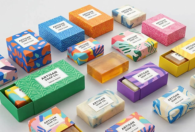
Packaging color is the element customers see first. Before they smell the product, feel the appearance, read ingredients, or check size, it is the color that builds the first impression. And if the color succeeds in catching the attention of the potential buyer, the next elaements can play their roles. The same formula applies to soap packaging, which is one of the most essential products in every home and every office.
In this blog, we will understand the color psychology for soap packaging and what colors demonstrate about your soap brand.
What Is Color Psychology in Packaging?
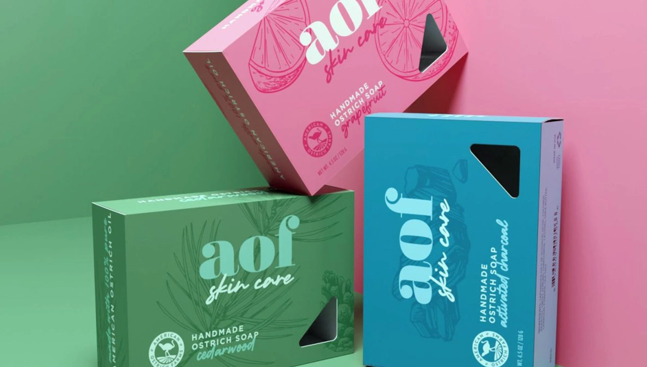
Color psychology in packaging is the study of how specific hues, colors, and shades on the product containers influence emotional response, snap judgments, and purchase decisions. Colors are non-verbal communicators of quality, taste, and value. Customers build a unique perception about a product just by looking at it without knowing anything. Brands use this color psychology to leave a positive subconscious impression on consumers.
Importance of Color Psychology in Packaging
Color psychology is extremely important in packaging, as it shapes user perception. Studies demonstrate that up to 90% of snap judgments are based on the colors. Having the right set of hues presented on the package in the right order can help you build a positive impact from the customer’s perspective. This is the first step toward a successful purchase. Here are some reasons color psychology matters in packaging.
First Impression
Colors act in milliseconds. The right color strategy instantly communicates with the potential buyer and leaves a good impression of the product. The logos, typos, and ingredients come later.
Brand Recognition
Loyal consumers can easily identify and recognize the brand by colors when it is placed on crowded retail store shelves. This is not only for retention. Even new users can perceive a product as good quality if its packaging aligns with the consumer intentions and purchase decisions.
Expectation Setting
Buyers expect the product value, quality, and impact just by having a look at the package. This is especially impactful for edibles, cosmetics, and luxury products.
Modern Color Trends in Soap Packaging
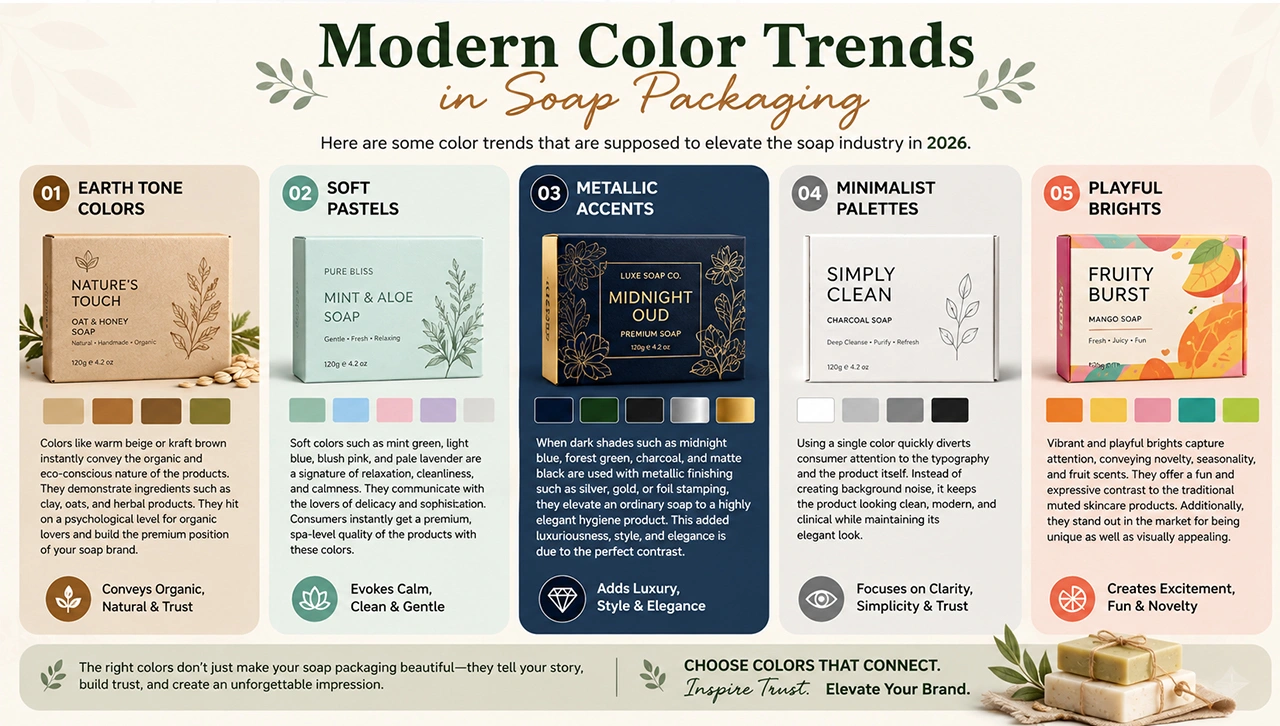
Here are some color trends that are supposed to elevate the soap industry in 2026.
-
Earth Tone Colors
Colors like warm beige or kraft brown instantly convey the organic and eco-conscious nature of the products. These colors demonstrate ingredients such as clay, oats, and herbal products. They hit on a psychological level for organic lovers and build the premium position of your soap brand.
-
Soft Pastels
Soft colors such as mint green, light blue, blush pink, and pale lavender are a signature of relaxation, cleanliness, and calmness. They communicate with the lovers of delicacy and sophistication. Consumers instantly get a premium, spa-level quality of the products with these colors. These colors also inherently indicate softness for sensitive skin.
-
Metallic Accents
When dark shades such as midnight blue, forest green, charcoal, and matte black are used with metallic finishing such as silver, gold, or foil stamping, they elevate an ordinary soap to a highly elegant hygiene product. This added luxuriousness, style, and elegance is due to the perfect contrast of dark colors with light metallic finishing.
-
Minimalist Palettes
Using a single color quickly diverts consumer attention to the typography and the product itself. Instead of creating background noise, it keeps the product looking clean, modern, and clinical while maintaining its elegant look.
-
Playful Brights
Vibrant and playful brights capture attention, conveying novelty, seasonality, and fruit scents. They offer a fun and expressive contrast to the traditional muted skincare products. Additionally, they stand out in the market for being unique as well as visually appealing.
How to Choose the Right Color for Soap Packaging
Colors speak your brand language. They tell the audience what your brand is about, its products, transparency, cleanliness, etc. That’s why the best strategy is to spend significant time understanding color psychology and choosing the color that both fits your audience and conveys your brand message.
Here is a brief overview of how you can choose the right colors for your soap brand.
Research Your Audience
Don’t choose what looks good for your soap. Choose the colors that attract your audience. For example, black, golden, or jewel colors are ideal for targeting luxury consumers. Green, natural, and earthy colors appeal to an eco-conscious audience. Soft pastels or clean whites convey that the product is quite right for skincare consumers or those with sensitive skin.
Consider Product Ingredients
Your colors should speak about the ingredients before consumers actually read the list. Use green or herbal types of shades if you use organic products. Similarly, dark grey or black indicates a strong cleaning effect with premium ingredients. If your soap uses some aromas or the flavor of a fruit, use a color corresponding to that fruit.
Match With the Packaging Material
The colors should also be kept aligned with the packaging material. For example, simple kraft paper can usually be best represented in its natural brown colors. Similarly, some bold, vibrant colors make good contrast with the foil and stamp finishing.
Core Soap Colors and Their Meanings
Different colors set different expectations for consumers at a subconscious level. Here is what some popular colors convey with respect to the soap industry.
- White conveys purity, cleanliness, and simplicity
- Green signals nature, freshness, and eco-friendliness
- Blue represents water, hygiene, and deep hydration
- Black communicates sophistication, elegance, and value
- Pink evokes softness, romance, and gentle care
- Brown suggests earthy, warm, and natural elements
- Orange inspires optimism, energy, and joy
Conclusion
Colors play an important role in consumer decisions. With the right color, you can present your soap in style, set a positive vibe, and increase the perceived value of the product. Matching the packaging colors with the audience's taste, packaging materials, and the ingredients within the soap itself is also essential for being natural, transparent, and consumer-focused. First, understand the color psychology; second, choose the right color according to your product and audience, and then present that color in the right way so the audience actually notices and loves it.
If you want premium soap packaging with high-class product-specific colors, feel free to contact The Box Lane.
FAQs
What is the color psychology in soap packaging?
It is the study of how soap packaging colors influence customer attention, quick judgment, and purchase decisions. It helps brands choose the winning colors for their brands.
What color fits my organic soap brand?
Green is generally the best color for organic soap packaging. It conveys organic, eco-friendly, and natural ingredients.
What are some best colors for soap packaging?
Green, blue, pink, and black are some of the best colors for soap packaging. Green is for organic, blue is for softness, pink is for gentle care, and black is for premium quality.
How to choose the right color for my soap packaging?
Choose the colors that align with your audience preferences, fit the packaging materials, and highlight the ingredients clearly.
What colors make the best choice for luxury soap brands?
Black, gold, and jewel colors make the best choices for luxury soap brands, as they instantly highlight premium quality and value.